For decades, we have designed software starting from an implicit idea: the user must understand the system.
Software exposes functions, menus, commands, forms, tables, filters, and options. The user observes, interprets their goal, searches for the correct function, follows the expected sequence, and completes the task. When everything goes well, nobody complains. When something becomes complicated, the problem is often blamed on the user. They did not read the manual, they did not follow the procedure, they do not know the product well enough.
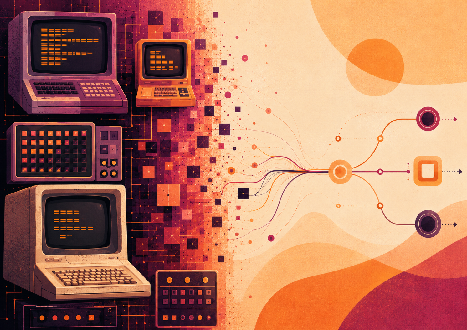
This approach has understandable origins. The first software interfaces were born in technical environments, for specialized users, within expensive systems and highly structured tasks. First the command line, then menus, windows, toolbars, configuration panels, and large business applications all preserved the same underlying logic. The system makes its capabilities available; the user learns how to use them.
This is the deductive interface paradigm.
In a deductive interface, the software displays the tools and the user deduces the correct action. They must know the domain, understand the structure of the application, remember rules, interpret states, recognize exceptions, navigate between screens, and translate an operational goal into a sequence of commands.
This model worked for a long time because it was consistent with the world in which it was born. Software was a specialist tool. Complexity was part of the job.
In professional systems, this idea has survived more than anywhere else. ERPs, business management systems, industrial software, administrative platforms, and technical tools often still require users to perform an enormous amount of daily deduction.
The point is that today this complexity has a cost.
It costs in onboarding, training, support, errors, operational slowness, and dependence on expert users. It also costs in perceived quality, because a product can be powerful and, at the same time, appear heavy, opaque, and exhausting.
Many software products do not fail because they lack features. They struggle because they ask the user to perform too much cognitive work before they can even begin working.
This is where the change in perspective begins.
An inductive interface does not start from the question: “Which functions should I show?” It starts from a more useful question: what is the user trying to achieve right now, and what signals does the system have in order to help them move forward?
The inductive interface observes the context, interprets the state of the work, recognizes priorities, reduces noise, makes plausible actions more visible, and guides the user toward the next step. It does not replace human judgment. It prepares it better.
The difference can be summarized as follows:
In a deductive interface, the user must orient themselves within the system; in an inductive interface, the system begins to orient itself around the user.
This is the central point.
An inductive interface is not a chatbot placed on top of a screen that has remained the same. It is not an AI assistant positioned next to a difficult table. It is not blind automation. It is a different architecture of experience.
It can use simple rules, application states, historical data, recurring patterns, operational priorities, or artificial intelligence models. The technology changes. The principle remains: software should use what it knows to reduce the friction of action.
This is where the topic becomes decisive.
Designing inductive interfaces means designing states, context, signals, priorities, exceptions, levels of autonomy, and responsibility. It also means designing trust.
If the system suggests something, it must make clear why. If it proposes an action, the user must be able to correct it. If it reduces complexity, it must leave access to control. If it guides, it must do so without becoming paternalistic.
An initial definition could be this:
An inductive interface is an interface that uses context, the state of the system, and the available signals to make the most relevant actions for the user more visible, timely, and understandable, while preserving transparency and human control.
This definition opens the discussion.
How do we recognize an interface that is still too deductive? Which signals allow a system to guide without intruding? Where does good simplification end, and where does paternalism begin? What relationship exists between inductive interfaces, artificial intelligence, workflows, dashboards, automation, and traditional UX?
And above all: how do we design all this in real, complex products already used by people who need to work?
This article establishes the starting point. The problem with professional software is not having more features. Often, we already have too many.
The problem is transforming interfaces that force the user to decode the system into interfaces capable of reading the operational moment more effectively.
From deductive interfaces to inductive interfaces, there is not only a technical evolution. There is a shift in responsibility.
Software should not merely say: “Here is everything you can do.”
It should begin to say: “In this situation, here is what truly matters.”
Leave a comment
Your comment will be visible after moderation.