There is a scene that repeats itself with almost embarrassing regularity in software analysis and design meetings. The requirements document is opened, and people discuss entities, fields, validations, business rules, roles, permissions, deadlines, exceptions, and special cases. Then they move on to acceptance tests: given this input, the system must produce this output; if a mandatory piece of data is missing, it must report an error; if the status is closed, the action must not be available.
At some point, the UI appears too. But rarely as an object of design. More often, it appears as the final surface on which decisions already made elsewhere are placed.
The discussion then becomes: should we put this field here or there? Do we need this button? Is this column mandatory? Should the grid have a filter? Should the form have an additional tab? The client asks for another field. The user wants a flag. The administrative department wants a note. The sales manager wants to see one more column. The developer takes notes, mentally estimates the impact, tries not to let time and costs spiral, and in the end the usual solution is reached: a list or grid for multiple records, a detail view for a single record, an edit form, buttons for CRUD operations, a few filters, a few tabs, a few modal dialogs.
Everything works. Or at least it compiles.
But the user, standing in front of that software, will have to figure things out alone.
My impression: the UI as the younger child of the software project
My impression, formed over time, is that the user interface has often been treated as a secondary topic in software engineering. I am not saying that there are no disciplines, books, and courses dedicated to Human-Computer Interaction, user experience, usability, or interaction design. That would be false. They exist, they are important, and they have a solid scientific and professional tradition.
The point is something else: in ordinary software development practice, especially in business, enterprise, and B2B contexts, the UI rarely enters the process with the same dignity as a data model, a functional requirement, an architecture, a testing pipeline, or a release plan.
The UI is seen as the place where features are “shown,” not as the place where the user’s work is actually designed.
And that difference is enormous.
A system can meet all functional requirements and still remain cognitively hostile. It can pass acceptance tests and slow down its users every day. It can have a correct data model and a UI that forces the user to remember, infer, search, interpret, correct, ask for help, undergo training, and build defensive habits (see Figure 1).
In these cases, the software does not fail because it does not work. It fails because it works by shifting the cost onto the user.
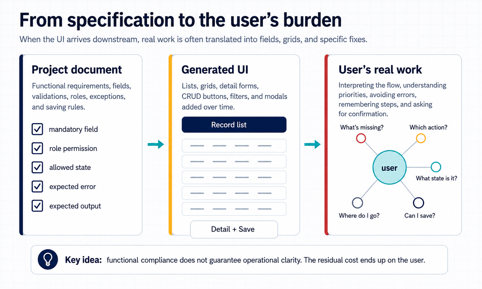
Figure 1 — When the UI arrives downstream from the project, formally correct requirements can turn into complete but poorly guided CRUD screens. The remaining burden is shifted onto the user, who must interpret the operational flow.
This is not a criticism of UX or visual design
It is important to immediately clarify a possible misunderstanding. The criticism in this article is not aimed at UX as a discipline, nor at UI design as such. I am not saying that the work of UX designers, interaction designers, product designers, or visual designers is irrelevant. On the contrary: without that body of expertise, much software would be even more opaque, inconsistent, and difficult to use.
A UI can be beautiful, consistent, accessible, well laid out, aesthetically modern, and functional. It can follow a design system, use orderly components, have good spacing, correct colors, readable text, and a respectable visual hierarchy.
But induction in interfaces deals with another level of the problem.
It is not only about how a screen looks. It is not only about whether the user finds a button or understands a label. It is not even merely about the overall fluidity of the experience. It is about the way the system interprets the operational moment and helps the user move forward.
An inductive interface does not merely present data and commands in a pleasant way. It tries to understand, through states, context, constraints, priorities, and signals, what the most sensible next action is for the user. It reduces the number of useless possibilities, anticipates recurring decisions, makes the relevant conditions visible, separates what is urgent from what is secondary, and accompanies the flow instead of merely exposing it.
This distinction is crucial. You can have good traditional UX within a paradigm that is still deductive. The interface is orderly, but the user must still infer the path. The interface is pleasant, but it does not read the context. The interface is consistent, but it exposes all possibilities at the same level. The interface is usable, but it does not guide enough.
Inductive interfaces do not replace UX. They extend it toward a form of design that is more operational, more dynamic, and more connected to the real structure of work.
The acceptance testing paradox
User acceptance tests should be the place where software encounters operational reality. But they often measure only whether a function produces the expected result, not whether the user can reach that result with clarity, continuity, and safety.
We verify that the button saves. Not that the user understands when they should save.
We verify that the mandatory field generates an error. Not that the user understands beforehand which fields really matter.
We verify that the workflow allows a procedure to be completed. Not that the procedure is readable, guided, proportionate to the task, resistant to errors, and coherent with the context.
We verify that the application accepts an order, an invoice, a request, a registration, a document. But we rarely verify the cognitive load imposed on the operator in order to reach that result.
This is a design failure, not merely an aesthetic one.
The UI is not the decoration of software. It is the point where the mental model of the system meets the mental model of the user. When this encounter is poorly designed, the user must become a permanent translator between what they want to achieve and what the system allows them to do.
The old pattern: grid, detail, CRUD
In professional software, the dominant pattern is still very often the administrative one: list, detail, edit, save. It is a powerful model, simple to implement, coherent with relational databases and management-oriented logic. But it is also a model that tends to make the interface coincide with the structure of the data.
If there is a customer table, we will have a customer list and a customer form. If there is an order table, we will have an order list and an order detail. If there are document rows, we will have a row grid. If there is a status, we will have a combo box or a badge. If there is a flag, we will have a checkbox.
This approach has one advantage: it is predictable for developers.
But it has one flaw: it almost never starts from the user’s real task.
The user does not think, “I need to modify a record in the orders table.” They think: “I need to understand why this order is blocked,” “I need to complete a shipment,” “I need to correct an error before invoicing,” “I need to find the urgent requests,” “I need to understand what is missing in order to close this case.”
The software, instead, offers them entities, fields, states, and generic actions. Then it asks them to mentally reconstruct the path.
This is where part of the friction begins: not in the presence of the grid itself, but in the fact that the grid becomes the universal way of representing every problem. It is as if the entire operational reality were flattened into the same mold.
Why inductive interfaces require a different design approach
If we take the idea of an inductive interface seriously, changing the layout is not enough. It is not enough to move a button, lighten a table, reduce the number of fields, or improve the wording of a label. All of this can be useful, but it is not yet the heart of the problem.
An inductive interface requires a different design approach from the usual one. It is not only about deciding what to show, but about modeling the behavior of the system in relation to the user’s operational moment.
| Usual approach | Inductive approach |
|---|---|
| Designing screens | Designing states |
| Designing navigation | Designing transitions |
| Designing buttons | Designing contextual actions |
| Designing permissions | Designing availability conditions |
| Designing confirmations | Designing consequences |
| Designing messages | Designing signals |
| Designing visual ordering | Designing operational priorities |
| Designing the page | Designing the moment the user is in |
This perspective profoundly changes the work of analysis. In a traditional approach, we ask: which fields are needed? Which operations are allowed? Which rules must the save operation respect? Which views do we need to create? Which filters are required?
In an inductive approach, other questions are added to these, closer to the real behavior of the system and to the user’s work.
| Design question | Why it matters in an inductive UI |
|---|---|
| What state of the process is the object in? | Because the state determines what is relevant, possible, or risky at that moment. |
| Which transaction is the user trying to complete? | Because the interface must guide an activity, not merely expose data. |
| Which actions make sense now, and which do not? | Because showing all actions at the same level increases decision load. |
| Which information really changes the next decision? | Because not all data has the same operational weight. |
| Which conditions make an action risky? | Because the system should prevent errors, not merely report them afterward. |
| Which step can be anticipated, suggested, or automated? | Because an inductive UI reduces repetitive deductions and mechanical work. |
| Which choices can be hidden until they become relevant? | Because complexity should be made progressive, not dumped onto the user all at once. |
| Which feedback allows the user to feel sure they have done the right thing? | Because feedback is not decoration: it is part of operational continuity. |
This kind of design cannot arise downstream, when the data structure has already been transformed into forms. It must enter earlier, in the way the domain, states, use cases, transactions, exceptions, and operational decisions are modeled.
An inductive UI is not a “prettier” UI. It is a UI that incorporates a reading of the process.
That is why it is closer to behavior design than to simple surface design (see Figure 2).
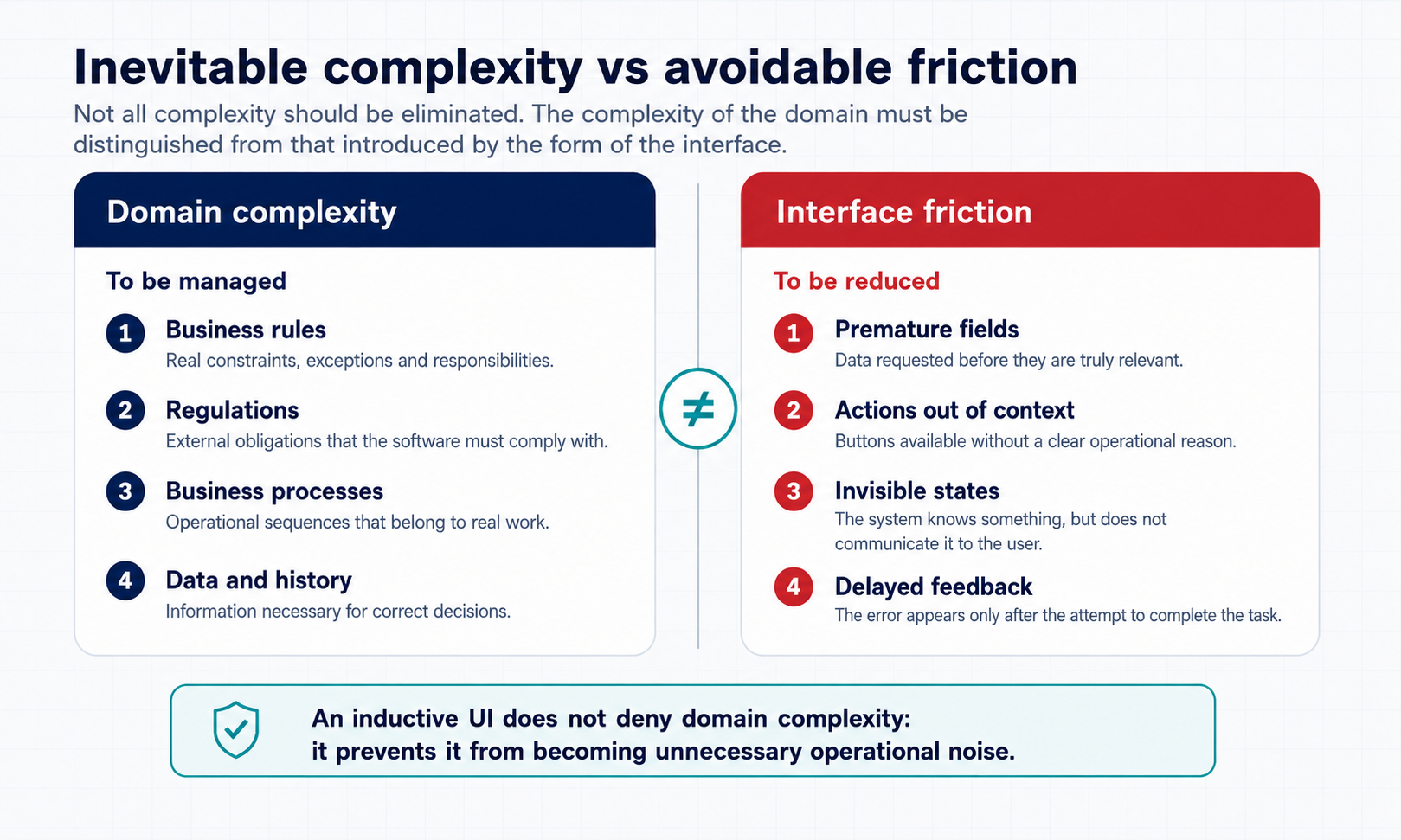
Figure 2 — An inductive UI requires designing the behavior of the system: current state, constraints, context, recommended actions, transitions, and feedback. Operational guidance emerges from this structure, not only from the arrangement of visual components.
Why does this happen?
It happens for understandable reasons.
The first is economic. Truly designing the UI takes time: observing the work, understanding roles, distinguishing essential data from secondary data, identifying decision points, simulating errors, building visual hierarchies, and verifying the flow with real users. When the budget is tight, all of this appears expendable.
The second is cultural. Many software teams are trained to think in terms of features, data, architecture, code, and tests. These are fundamental dimensions. But if the UI is not considered part of engineering design, it will end up being treated as an assembly phase.
The third is contractual. In project documents it is easier to write “the system must allow modification of the customer master data” than “the system must guide the operator in correcting missing information by reducing steps, ambiguity, and unnecessary decisions.” The first requirement is easy to test. The second requires qualitative criteria, operational metrics, scenarios, and observation.
The fourth is defensive. When complexity emerges late, the developer tries to limit the damage. They add a field, move a button, make a piece of data mandatory, insert a modal dialog, add a confirmation. Each intervention is rational in the short term. But over time the system accumulates friction.
The fifth is organizational. In meetings, the client often talks about the UI through punctual requests: “I need this column,” “I want this filter,” “let’s add this button.” These requests look like requirements, but they are often symptoms. Behind a requested column there may be a priority problem. Behind a filter there may be an orientation problem. Behind a button there may be an undesigned workflow.
The sixth reason is technical. Many application architectures are built around entities and CRUD operations, not around processes and states. When the backend mainly exposes generic data and operations, the UI tends to replicate that structure. If the system does not clearly model progress states, allowed transitions, contextual actions, and operational conditions, the interface does not have enough material to become inductive. It can only show everything and let the user choose.
A possible criticism of my thesis
There is a strong criticism of the considerations just made: perhaps the problem is not that the UI is excluded from software engineering. Perhaps the problem is that many projects do not properly apply what already exists.
Indeed, Human-Computer Interaction exists. Usability exists. User-centered design exists. There are heuristics, research methods, usability tests, prototyping, accessibility, design systems, interaction design, service design, UX research. There are also university programs and specific courses. Saying that “no one talks about it” would be unfair.
Moreover, not all complexity can be removed. Professional software is not a consumer app with three actions. An ERP, a MES, a healthcare management system, an administrative system, or industrial software must represent complex rules, regulatory constraints, exceptions, responsibilities, historical data, and configurations. Expecting absolute simplicity would be naive.
There is also another objection: expert users do not always want a simplified interface. Sometimes they want power, information density, shortcuts, control, and rapid access to many functions. A UI that is too guided can become slow, paternalistic, and limiting.
These criticisms are valid. And in part they demolish the most naive version of my thesis.
The problem is not “UIs are not studied.” The problem is not “everything must be simple.” The problem is not “grids are wrong.” The problem is not “users should not have to learn anything.” Nor is the problem “traditional UX is useless.”
The problem is more precise: in ordinary software analysis and design processes, the UI is often disconnected from the verification of real work. It is considered the output of features, not the cognitive structure of the task.
And induction in the UI requires exactly this leap: treating the interface as a cognitive and operational structure, not merely as a graphical representation.
The corrected thesis: not simplicity, but cognitive responsibility
The point is not to simplify everything. The point is to take responsibility for the cognitive load that software produces.
There is inevitable complexity and there is useless complexity.
Inevitable complexity comes from the domain: regulations, business processes, technical constraints, cases, business rules.
Useless complexity, on the other hand, comes from the form of the software: information without hierarchy, actions outside their context, fields exposed too early, redundant steps, ambiguous messages, poorly visible states, late errors, screens built around the database instead of around the task.
This second kind of complexity is not destiny. It is missing design (see Figure 3).
When the system does not guide, the user infers. When the system does not organize, the user interprets. When the system does not signal priorities, the user builds them alone. When the system does not protect against errors, the user develops informal procedures. When the system does not clarify the state, the user asks for confirmation outside the software.
The load does not disappear. It moves.
And it almost always ends up on the user.
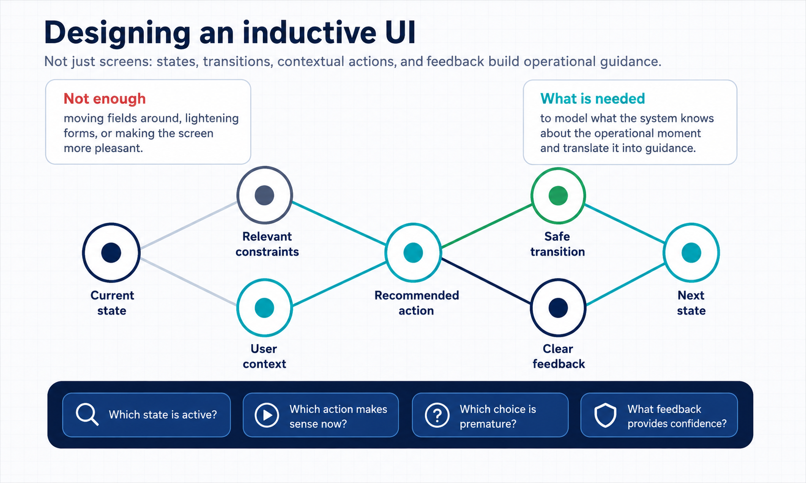
Figure 3 — Domain complexity is not the same thing as interface friction. An inductive UI does not deny rules, constraints, and processes: it reduces the operational noise produced by premature fields, out-of-context actions, invisible states, and delayed feedback.
From UI as screen to UI as workflow
Perhaps we should stop designing “screens” and start designing “moments of work.”
A screen should not be judged only by its functional completeness, but by the questions it imposes on the user.
| Question the UI should help answer | What it reveals |
|---|---|
| What should I do now? | Whether the screen truly guides the next action or merely shows possibilities. |
| What is the most important information? | Whether there is an operational hierarchy or only an arrangement of data. |
| Which data is truly mandatory at this moment? | Whether the system distinguishes between current necessity and administrative completeness. |
| Which actions are available, and why? | Whether the user understands the meaning of actions, not just their presence. |
| What happens if I make a mistake? | Whether the system prevents and explains operational risk. |
| Where am I in the process? | Whether the workflow state is visible and understandable. |
| What is missing to complete the task? | Whether the interface orients the user toward closing the work. |
| Which decision must I make now, and which can be postponed? | Whether the UI reduces decision load and organizes complexity over time. |
These questions are not aesthetic. They are engineering questions. They determine time, errors, training, support, adoption, and operational quality.
A well-designed UI is not necessarily minimal. It is a UI that distributes mental effort well, makes the state visible, brings the action closer to the context, separates what is needed now from what can wait, and does not transform every exception into a field that is always present.
But to achieve this result, we also need to change the way software is conceived before the UI.
| Design condition | Consequence for the UI |
|---|---|
| The system knows its own states | It can show them clearly and use them to guide the user. |
| The system models transitions | It can accompany the passage from one phase of work to another. |
| The system distinguishes generic actions from contextual actions | It can avoid exposing commands that all look the same, are always available, and are not very meaningful. |
| The system represents operational conditions | It can suggest the next useful action instead of leaving everything to the user’s deduction. |
The inductive interface therefore emerges from the encounter between domain design, process design, and interaction design.
Why this concerns InductiveFlow
InductiveFlow arises precisely from this fracture: software can be technically correct and operationally tiring. It can meet requirements and betray the work. It can be formally accepted and remain heavy every day.
Talking about inductive interfaces means starting here. Not from the idea of making everything beautiful, modern, or generically “user friendly,” but from the idea that the system should help the user proceed. An inductive interface does not dump the entire deduction of the process onto the user. It observes the context, narrows the possibilities, proposes priorities, makes states visible, and guides action.
It does not replace the domain. It does not trivialize complexity. It does not eliminate the user’s expertise.
But it rejects the idea that the user must pay every day for software designed only as a sum of functions.
InductiveFlow does not set induction against UX. Rather, it says that there is an additional level, still not sufficiently explicit in ordinary software processes: the design of the interface as a system that interprets states, transactions, operational intentions, and possible actions.
A UI can be beautiful. It can be usable. It can be consistent. But the inductive question is different: does that UI really help the user understand what to do next?
Conclusion
The UI is not the last layer of software. It is the place where software becomes human work.
As long as we continue to treat it as an arrangement of fields, buttons, and grids, we will continue to produce systems that are formally correct but cognitively expensive. As long as acceptance tests verify only the functional result and not the user’s path, we will continue to call software “working” when it works only because someone, every day, compensates for its shortcomings.
My frustration in analysis meetings comes from this: from the feeling that the real cost of badly made software is almost never paid by those who design it, but by those who use it.
And perhaps the first step is not even to change technology. It is to change the question.
Leave a comment
Your comment will be visible after moderation.